Most digipaks follow a fairly standard criteria when created. When you open one you can expect to find the following:
-Photographs - usually at least one of these will be a close up or medium shots of the artists. The rest of the images will be used to create a mood and reflect a theme that can be seen within the music.
-Track List - typically on the back of the digipak, a track list is included to show the name of every track that is on the album. This list also tells the consumer the order in which the songs will be played.
-Barcode and record company logo - These are present as a way of advertisement, if the consumer likes what they hear on this CD, they know where they can find similar content. In a similar light, somewhere else in the digipak there may be a list of the artists/bands previous work.
-Information on the Album and Artist - Given that a digipak contains extra content than a regular CD purchase, it is not unlikely that you will be able to find more detailed information on each member of the band, including key points such as what instruments they play and what external roles they may have within the band. This list may also include other people that assist with production that would not necessarily be seen on stage performing.
A unique design on the inside of the digipak is also typically present, the themes and colors match the topic of the music in some way.
The album name contradicts the design in some ways, the name ''Human After All'' does not match the heavy reference to computers and machinery that can be inferred from this design.
The back cover is mostly black, but uses the theme presented by the rest of the pack in an interesting way to highlight the track list. Purple lines connecting from the barcode to the name of each track makes them serve the purpose of bullet points. This is not something you see very often, which adds to how interesting the design of this digipak is. The inner panels have lyrics for two of the songs ''Technologic'' and ''Digital Love.'' This is not an unconventional use for space within a digipak, so despite the uniqueness of this design, some conventions are followed as well. Despite how intricate and interesting the digipak design is, the disc itself does not play into this, as it is a plain yellow disc with the words ''Daft Punk'' written on them in the same font as can be seen on the front of the album.
The next example I will look is Green Day's ''American Idiot.'' The bands name stands out because it is written in a large font in white writing against a black font. The Album's name is also clearly visible because red and black contrast each other really well. Despite being basic, in design, the front cover is effective because of the colors that were chosen. This look is very conventional for the genre of music, which means fans will know what to expect when looking into this album. Some of the songs found within this album have political motivation, which means the heart shaped grenade can be interpreted in several ways. One example of this is that the American government expects the nation to tear out their hearts and fight for America without ever questioning the governments motives because they are supposed to be patriots who love the country.

The back of the digipak is very standard by design, it includes a list of the tracks on the album as well as a parental advisory disclaimer. Additionally, a barcode is present as expected, and the color scheme remains consistent. The image on the back of the back of the album is a grenade pull pin. This time there is no grenade, which heavily implies that if change does not come to America the government will have pulled the pin and destroyed the heart of America as a nation.
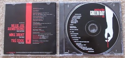
The disc also continues the color scheme of red black and white.
The track list can be seen on the disc, also, the insert that can be seen to the left of the disc has the lyrics for all the songs on the album. The consumer can also read about the band members, their roles within the band and their nicknames. Also listed are some of the people that helped with the production of the album.


No comments:
Post a Comment